Using R to draw maps on country data
Author: Xavier Fernández-i-Marín
October 17, 2012 - 2 minutes
Spatial models Data visualizationWhen doing research in comparative politics, International Relations or world governance is often convenient to have an idea of the spatial distribution of certain characteristics of countries. Therefore, being able to draw maps is a useful technique that any researcher or practitioner must have in his or her toolbox.
R allows drawing maps in a quick and easy way, integrating also the visualization of data with the process of data management and model interpretation.
The rworldmap is the library that allows both joining country data with the shapefiles of each country and plotting the desired variables.
Here it goes a simple example using an easy and invented dataset:
library(rworldmap)
d <- data.frame(
  country=c("Greece", "France", "Germany", "Italy", "Norway"),
  value=c(-2, -1, 0, 1, 2))
The data must be converted into an object that rworldmap understands:
n <- joinCountryData2Map(d, joinCode="NAME", nameJoinColumn="country")## 5 codes from your data successfully matched countries in the map
## 0 codes from your data failed to match with a country code in the map
## 238 codes from the map weren't represented in your datawhere joinCode can be to match countries by name, by their ISO code or other ways; nameJoinColumn is the name of the column that belongs to the country in the d object.
The call to joinCountryData2Map gives some information about the success or failure of the matching procedure, and we can then correct the names of the countries to match. Sometimes this can be tedious. So it is always convenient to work with country names as much standardized as possible.
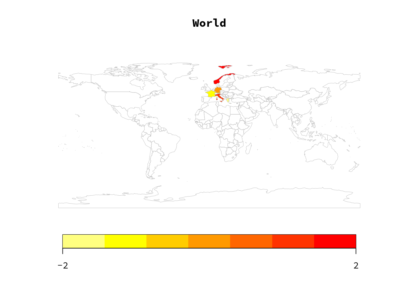
Then a world map with the default colours (heat scale) can be easily produced by the following code, where the argument nameColumnToPlot is the name of the variable that we want to plot
mapCountryData(n, nameColumnToPlot="value", mapTitle="World")
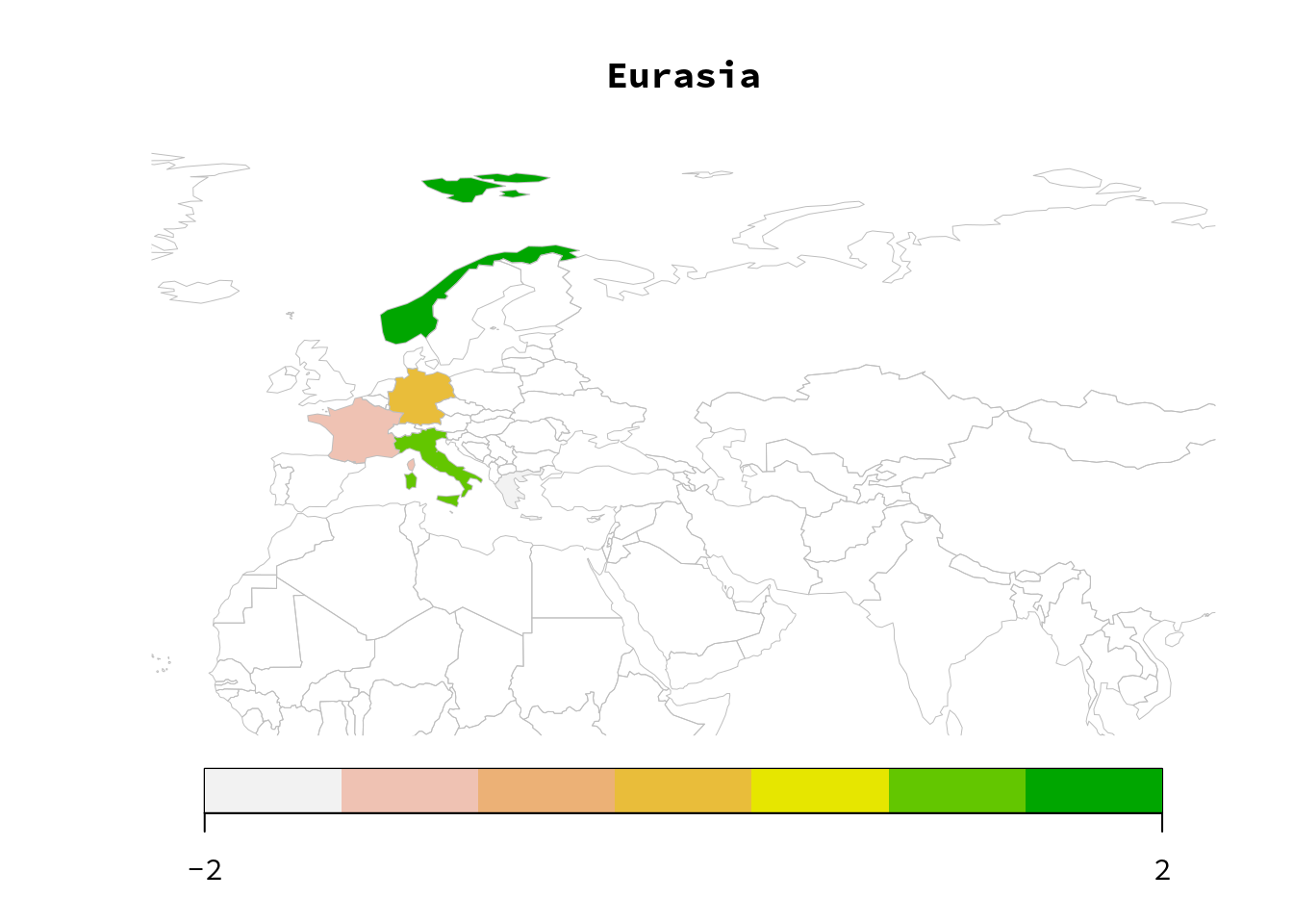
We can then select areas of the world and different colours
mapCountryData(n, nameColumnToPlot="value", mapTitle="Eurasia",
  mapRegion="Eurasia", colourPalette="terrain")
Or set the limits by using latitude and longitude, assign colours to the ocean and to missing values, and use a black and white palette.
mapCountryData(n, nameColumnToPlot="value", mapTitle="Europe, manual",
  xlim=c(-10, 40), ylim=c(35, 70),
  colourPalette="black2White",
  addLegend=TRUE,
  oceanCol="lightblue", missingCountryCol="yellow")